Colour contrast is the single most common accessibility failure on the web, and one of the easiest to fix once you know what you’re actually measuring. This guide covers what the ratios mean, the difference between the current WCAG standard and the newer APCA method, a worked example you can follow, the tools that check it (and where each one stops), and a short FAQ for the questions that come up on every project.
What “contrast ratio” actually means
WCAG 2.1 measures contrast as a ratio between the relative luminance of two colours, from 1:1 (identical) to 21:1 (pure black on pure white). “Relative luminance” is just how much light a colour reflects once you weight it for how the eye perceives red, green and blue. This is why a mid-grey and a mid-blue that look equally “medium” can score very differently. The thresholds you need to hit:
- 4.5:1 for normal body text (under ~18px, or under ~14px bold)
- 3:1 for large text (~24px+, or ~19px+ bold) and headings
- 3:1 for UI components and graphical objects: input borders, icons, focus rings, chart elements
One number worth memorising: #767676 is the lightest grey that still passes 4.5:1 on white. Anything paler, like the tasteful #999 placeholder, the faint #aaa caption, fails for body text. That UI threshold catches people out too: a pale input border or a faint focus ring might look tasteful, but if it drops below 3:1 against its background, users with low vision genuinely can’t tell the field is there.
2.8:1 fails
4.5:1 passes AA
7:1 passes AAA
A worked example
Say your brand colour is a punchy purple and you want to use it for a button label and for some body copy on a white card. You eyedrop the two pixels (the purple and the white behind it) and get a ratio of, say, 4.1:1. What does that tell you?
- Body copy: fails. 4.1 is under the 4.5:1 body threshold, so paragraphs set in that purple aren’t compliant.
- The button label passes if the label is large or bold enough to count as “large text” (3:1), 4.1 clears it comfortably.
You can keep the colour and darken it just enough to cross 4.5:1. Drop the purple a few steps in lightness and re-check; usually a small shift takes you from 4.1 to 4.7 or 5:1 with no visible change to the brand. Keep the original bright purple for large headings and accents, and use the darker variant for body text. That “one brand colour, two lightnesses” approach is how most accessible design systems handle it.
Bright brand purple works as a large heading (3:1)
The same purple as body text fails 4.5:1
Where designs usually fail
- Text on images or gradients. The contrast changes across the image. Test against the lightest part the text overlaps rather than the average.
- Brand colours on white. Many brand purples, blues and greens look bold but land around 3–4:1 , which works for a heading but fails for body copy.
- Disabled and placeholder states. “Greyed out” is often greyed past the point of legibility.
- Hover and focus states. They need to pass as well as the resting state.
WCAG 2 vs APCA: which should you use?
WCAG 2’s formula is simple but blunt: it treats contrast the same regardless of text size or whether you’re on a light or dark background, and it’s known to be too lenient on some dark-mode pairings and too strict on others. APCA (the Advanced Perceptual Contrast Algorithm) is the model proposed for WCAG 3. It scores contrast as a lightness value (Lc) from roughly 0 to 108, and it accounts for font size and weight, so a thin 14px label needs a much higher score than a bold 48px heading.
Practically: WCAG 2 is what you’re legally held to today (ADA, EN 301 549, most procurement). APCA is where the standard is heading and gives you a more honest read on dark mode. Checking both is the safe move. Pass WCAG 2 for compliance, glance at APCA to catch the cases WCAG 2 waves through.
The tools, and where each one stops
- Browser DevTools. Chrome’s colour picker shows a contrast ratio right in the Styles panel, and it’s free and always there. The catch is that it only reads a solid background it can compute, so it gives up on text over images, gradients or overlapping layers.
- Online checkers (WebAIM and similar). Great for checking two hex values you already have. The friction is that you have to get those hex values first, which means eyedropping or digging through CSS, and hoping no opacity or blend mode is changing the real rendered colour.
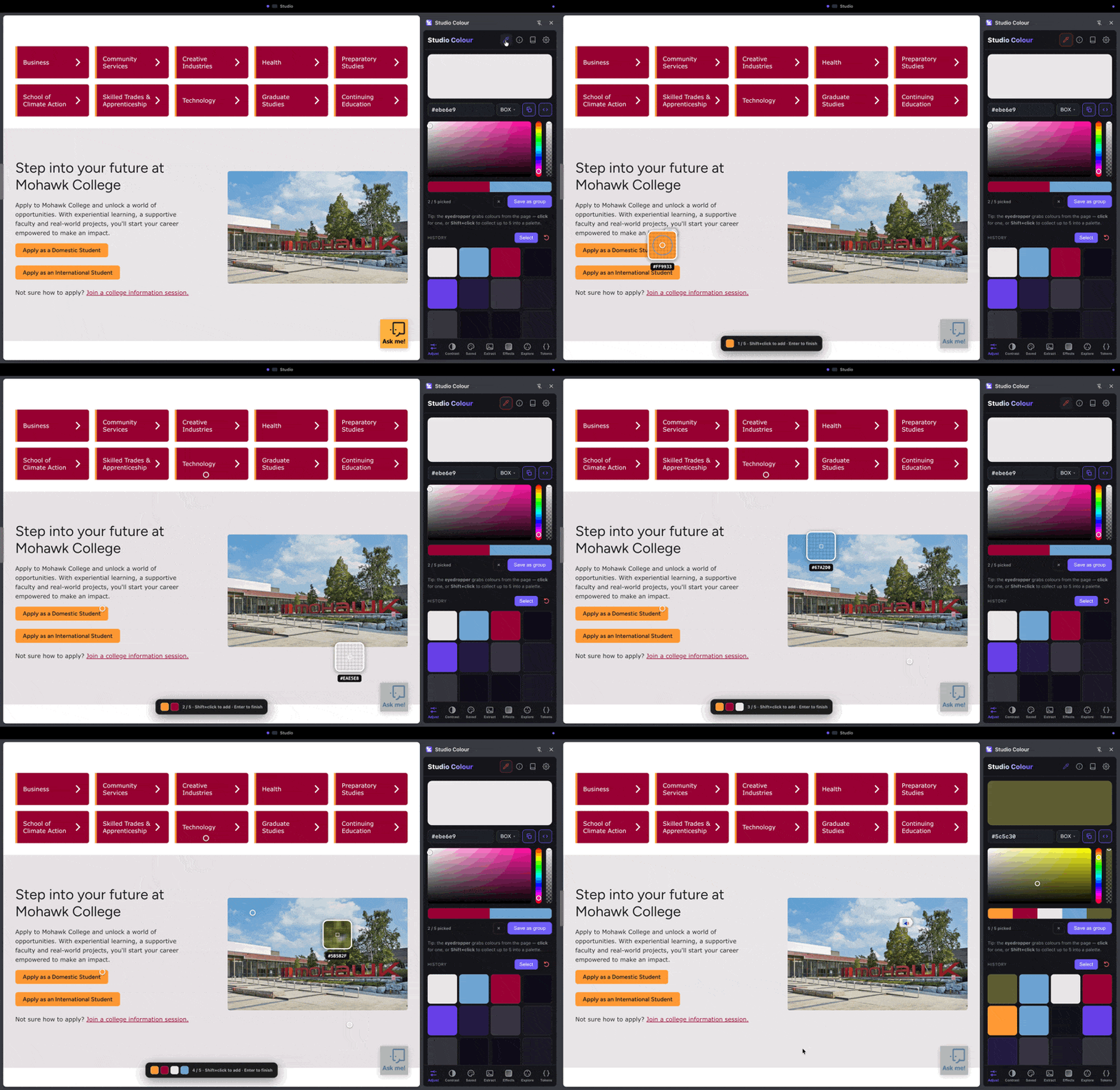
- An in-page eyedropper like Studio Colour. Samples the actual rendered pixels of anything on the page (an image, gradient or video frame) and shows WCAG 2 and APCA together, so there’s no copy-paste step and no guessing about which colour is really on screen.
How to check without guessing
- Sample the actual rendered pixels instead of the hex in your design file, which may sit under an opacity layer or a gradient.
- Check text at its real size and weight, since the threshold depends on both.
- Check every state: default, hover, focus, disabled, and both light and dark themes.
- Don’t forget non-text: borders, icons, focus indicators.
FAQ
What contrast ratio do I need? 4.5:1 for normal body text, 3:1 for large text (~24px+, or ~19px+ bold) and for UI components like borders and icons. Those are the WCAG AA levels almost everyone is held to; AAA raises body text to 7:1 if you need to go further.
Does contrast apply to large text too? Yes, at the easier 3:1 threshold, on the logic that bigger, heavier shapes stay legible at lower contrast.
What’s exempt? Logos and brand names have no contrast requirement, and neither do genuinely disabled controls or purely decorative graphics. Everything a user is meant to read or operate does.
Do I legally have to pass APCA? Not today. WCAG 2 AA is the standard written into current law and procurement. Treat APCA as a better second opinion, especially for dark mode, until WCAG 3 lands.
Is white text on my brand colour okay? Only if you check it. Bright brand colours often pass as large button labels but fail as body text, and the same “one colour, two lightnesses” fix applies.
Studio Colour eyedrops any two pixels on a live page and shows the WCAG 2 ratio and APCA score side by side, with a clear pass/fail for the text size you’re checking. Free Chrome side panel, never covers your canvas.